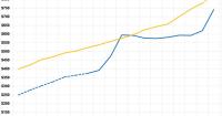
A couple of weeks ago, I received an email from a journalist who included this eyebrow-raising comment:
When I interviewed our Congressman, he said the ACA was a massive giveaway to insurers -- that premiums have increased 26% per year on average. That doesn't seem to match what little data I can scrape up, so I wanted to ask you: Since implementation in 2010, how much have premiums risen annually overall? Do you have data on how much or little they've risen or fallen for each year?
To this reporter's credit, he was skeptical about such a claim and reached out to me.
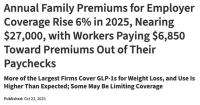
Annual Family Premiums for Employer Coverage Rise 6% in 2025, Nearing $27,000, with Workers Paying $6,850 Toward Premiums Out of Their Paychecks
More of the Largest Firms Cover GLP-1s for Weight Loss, and Use Is Higher Than Expected; Some May Be Limiting Coverage
Family premiums for employer-sponsored health insurance reached an average of $26,993 this year,KFF’s annual benchmark health benefits survey of large and smaller employers finds. On average, workers contribute $6,850 annually to the cost of family coverage, with employers paying the rest.
With the pending dire threat to several of these programs (primarily Medicaid & the ACA) from the House Republican Budget Proposal which recently passed, I'm going a step further and am generating pie charts which visualize just how much of every Congressional District's total population is at risk of losing healthcare coverage.
USE THE DROP-DOWN MENU ABOVE TO FIND YOUR STATE & DISTRICT.