


NATIONAL: How much more are ACA enrollees *really* paying this year due to Trump/GOP policies?
Mon, 07/06/2026 - 9:50am
REMINDER: Use the drop-down menu above to find the analysis for your state.
IMPORTANT: See the original post in this series for an explanation of the methodology.
Regular readers know that I've been obsessing over the massive increases in both gross as well as net premiums for ACA health insurance policy enrollees being caused by the combination of Congressional Republicans allowing the enhanced federal tax credits to expire as well as other Trump Regime policy changes for well over a year and a half now.
I've written countless analyses of how much both gross and net premiums skyrocketed from 2025 to 2026 across different states, different income levels and various other demographics...and recently it was confirmed that over 2.6 million ACA exchange enrollees had already been priced out of the market as of February, with the number almost certain to climb further throughout the rest of 2026.
As I've repeatedly warned, however, the increases in premium costs (whether gross or net) are only half the story. The other big shoe which is dropping this year is increased out of pocket costs as millions of the ~19.2 million or so remaining enrollees as of February have been forced to downgrade their coverage to avoid (or at least minimize) those massive premium spikes.
In most cases this means moving to plans with higher deductibles, higher co-pays & higher coinsurance costs. In many cases this has also included moving to plana with worse networks, referral requirements to see specialists and so on.
With that in mind, that's exactly what I've decided to set out to do: Calculate the average year over year increase not just in net premiums (that is, how much more ACA enrollees are having to pay each month) but also the year over year change in average out of pocket costs.
After 51 state-by-state analyses (including DC), I've finally reached the end of this project. Let's look at the NATIONAL data:
Here's national ACA exchange plan selections during Open Enrollment by household income level this year vs. last. It's important to keep in mind that this data is as of the end of the 2025 & 2026 Open Enrollment Periods only; it does not reflect actual effectuated enrollment for either year, which was ~21.8 million as of February 2025 and 19.2 million as of February 2026:
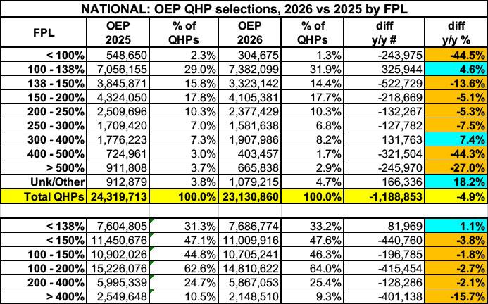
As you can see, OEP plan selections dropped substantially year over year across nearly every income bracket...and by as much as ~44% for enrollees who earn less than 100% of the Federal Poverty Level (FPL) and those who earn 400 - 500% FPL. The reasons for each of these are similar, though for different reasons:
- Enrollment below the poverty line plummeted largely because the Trump Regime eliminated subsidy eligibility for hundreds of thousands of low income documented (ie, legally residing) immigrants who have lived in the United States for less than 5 years and thus aren't eligible for Medicaid.
- Enrollment above 4x the poverty line plummeted largely because Congressional Republicans pointedly refused to extend the improved subsidies which allowed this population to be eligible for financial assistance on a sliding scale.
Both populations now have to pay full price, which is utterly impossible for the former and often impossible for the latter (especially if they're 50 or older).
Onto the main analysis:
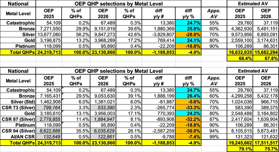
Here's total Open Enrollment plan selections for both 2025 & 2026 broken out by Actuarial Value (AV) category.
The first table is based on official metal level tiers, but it's the second table which is critical, since a huge chunk of ACA enrollees are usually enrolled in CSR Silver plans (which include Cost Sharing Reduction assistance). CSR assistance dramatically boosts the AV of Silver plans up to Platinum levels in most cases.
As I've noted for most of the individual states, millions of ACA enrollees were forced to downgrade to worse plans this year in order to at least partially mitigate the premium hikes. Enrollment in high-value CSR and Platinum plans dropped by 7.4 - 32%, as did lower-value Silver plan enorllment...while low-value Bronze and Catastrophic plan enrollment jumped by 25% or higher. The saving grace is that Gold plan enrollment also jumped by 24%, thanks primarily to a dozen or so states implementing robust Premium Alignment pricing.
Overall, however, the average actuarial value for enrollees still dropped by 3.4 points overall:
By combining these numbers with the average gross premiums per enrollee I'm able to calculate an estimate of the average total medical expenses each enrollee racks up each year assuming an 80% average Medical Loss Ratio (as I stated in the original post, this can vary widely by carrier and year, so should be considered a very broad average only), which looks like the table below.
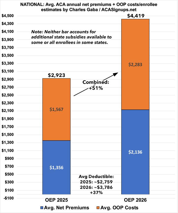
Important: Neither the table nor the graph below include the impact in either year of STATE-BASED FINANCIAL SUBSIDIES, which range from modest to very generous across a dozen or so states. I've accounted for those state subsidies in the individual analyses of most of those which are offering them this year.
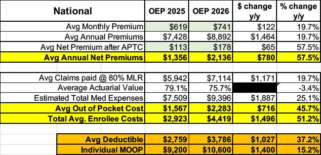
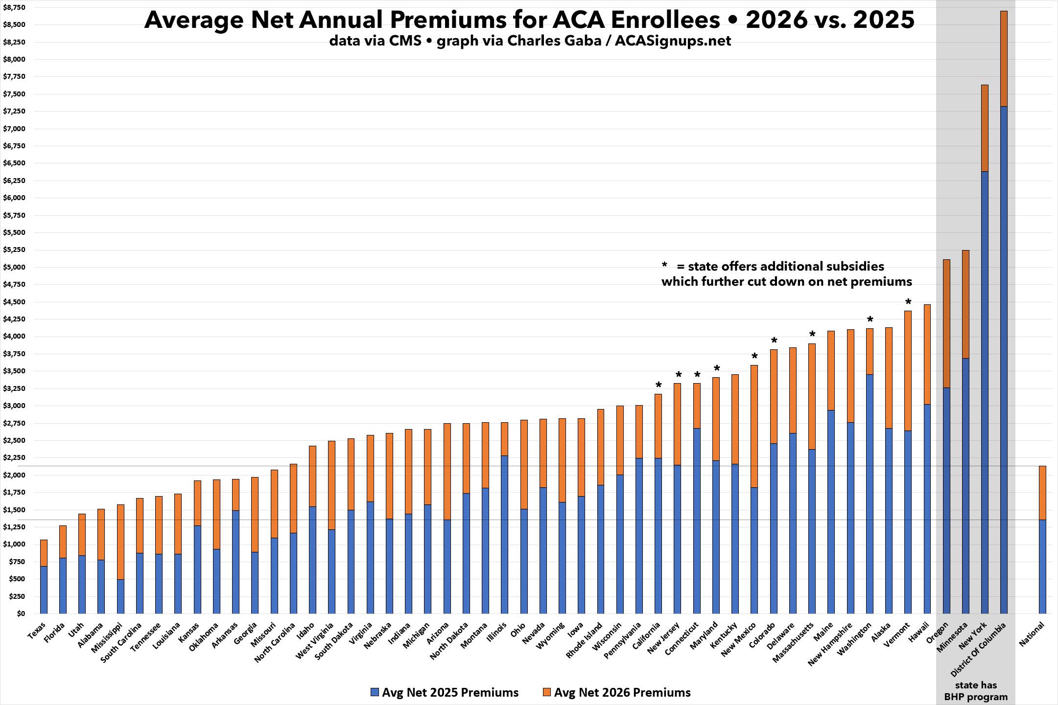
Nationally, on average, net ACA premiums have jumped by 58% this year vs. last, from $113/month to $178/month, or around $780/year more per enrollee.
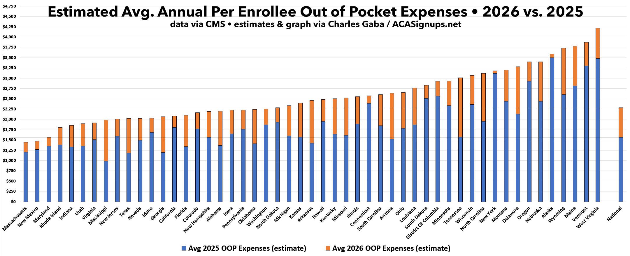
Meanwhile, by my estimates, average out of pocket expenses have jumped by around 46%, or another $716/year apiece.
Combined, to the best of my calculations, the ~19.2 million Americans who managed to hold onto their coverage through February of this year are paying over 50% more in total healthcare costs...or a whopping ~$1,500 apiece on average.
Here's what all 50 states (+DC) look like side by side, sorted lowest to highest by average net 2026 premiums. Note that, again, this graph does not include the additional subsidies available to some or all enrollees in 9 states this year. I've noted those 9 states as well as highlighting the 4 states which have Basic Health Plan (BHP) programs for residents who earn up to 200% FPL; BHP programs severely skew average net premiums for the enrollees who earn more than 200% FPL since the ACA exchange subsidies for that population are far less generous.
The next graph lines up every state by estimated average per enrollee out of pocket expenses this year versus last. Note that the order is different from the net premium graph above.
Whew! And with that, I'm done!
Advertisement


